 EN
EN

Gap between render‑ready visuals and real‑world print constraints
Digital mock‑ups for custom packaging design show flawless visual output on screen, yet many graphic treatments cannot be reproduced under actual press‑run conditions. Complex ultra‑thin strokes, overlapping multi‑layer foil effects and micro‑size decorative elements look impressive in design software. Physical offset, hot‑stamp and embossing equipment carry hard mechanical limits on minimum stroke width, registration tolerance and ink spread. Pure visual evaluation cannot reveal manufacturability risks. Artwork files built only for screen display frequently trigger costly revision cycles once handed over to packaging production teams. Design‑for‑manufacturability thinking bridges creative graphic vision against real‑world production boundaries.
Practical observations from bakery private‑label packaging iteration
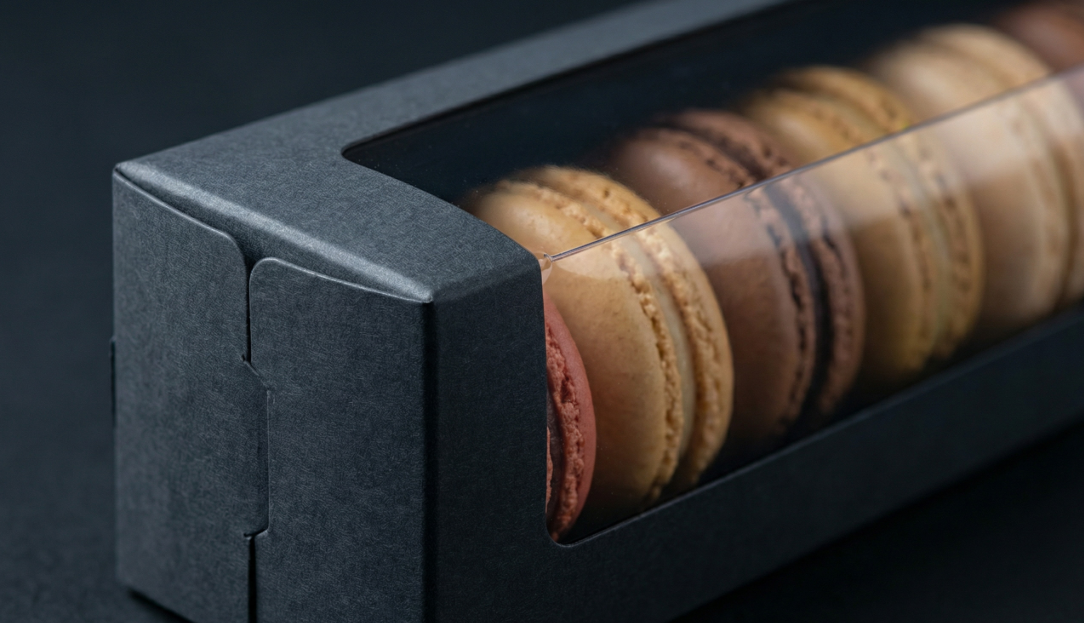
One mid‑sized bakery brand prepared private‑label macaron boxes for retail distribution. Initial artwork included extremely thin foil outlines below 0.1mm width plus multi‑stacked emboss and spot‑UV layers. Digital renderings delivered premium‑grade visual impact. V1 physical sampling revealed fragmented broken foil lines and misaligned emboss contours. Press operators noted that high‑speed converting equipment could not hold precise registration for such delicate combined treatments. Graphic teams adjusted stroke dimensions and simplified overlapping finishing sequences. Revised V2 samples achieved stable repeatable results. This real‑world brand project illustrates how visually attractive multi‑effect artwork can become unworkable without manufacturability reviews in early design phases.
Comparison of common graphic effects and corresponding production boundaries
Reference information draws from ISO 12647‑2 offset printing control standards widely adopted within commercial packaging workflows. The table below lists typical artwork treatments alongside practical constraints.
| Graphic Treatment | Minimum Recommended Dimension | Main Production Risk |
|---|---|---|
| Hot‑stamp foil fine lines | 0.2 mm stroke width | Broken or discontinuous foil transfer under high‑speed runs |
| Embossed decorative details | 0.3 mm relief feature size | Blurred, flattened contours after press pressure application |
| Spot‑UV micro patterns | 0.15 mm feature width | Ink dot merging and loss of fine detail |
| Ultra‑small positive text | 6 pt font size | Character filling‑in during ink transfer |
File‑level pitfalls that generate non‑manufacturable artwork
Many avoidable issues stem directly from source graphic file settings, not creative concepts. RGB color mode, insufficient image resolution and missing bleed margins create predictable print defects. Vector paths with excessive anchor points generated by AI design tools raise risks for hot‑stamp die fabrication. Packaging production workflows rely on CMYK or spot‑color specifications. Screen‑optimized RGB files produce unpredictable color shifts when converted for physical printing. Even visually perfect PDF previews hide underlying structural flaws which only surface at sampling stage. Pre‑production file audit routines catch most of these technical defects before physical sampling commences.
Conflicts between stacked special‑finish combinations and press tolerances
Multiple superimposed decorative finishes create desirable luxury aesthetics for bakery‑oriented custom packaging design. Yet each added finishing step introduces additional registration error. Sequential foil stamping, embossing and spot‑UV operations happen on separate machine stations. Cumulative minor position deviations can distort fine‑detail alignment. Designers sometimes stack three or more special effects onto identical graphic zones without accounting for press‑registration drift. It does not mean mixed finishes should be eliminated entirely. Strategic spacing, simplified local detail and reasonable feature‑size enlargement help retain premium appearance while staying within equipment tolerances.
Practical pre‑sampling evaluation checklist for manufacturable artwork
Several review actions reduce artwork‑driven delays and revision expenses before physical sampling begins.
- Cross‑verify stroke, text and feature dimensions against industry‑recommended minimum sizes.
- Confirm correct color space, image resolution and bleed settings within source artwork files.
- Assess cumulative registration risk for every area with stacked multi‑finish treatments.
- Conduct early technical review between graphic creators and packaging engineering resources.
Creative vision stays central, but technical validation prevents wasted sampling cycles and unexpected cost growth. BlissSmile runs multi‑gate sampling workflows with built‑in artwork and manufacturability checks. Its system‑oriented packaging service supports bakery‑focused private‑label and wholesale projects, balancing artistic expectation against proven production constraints for global brand buyers.
Table of Contents
- Gap between render‑ready visuals and real‑world print constraints
- Practical observations from bakery private‑label packaging iteration
- Comparison of common graphic effects and corresponding production boundaries
- File‑level pitfalls that generate non‑manufacturable artwork
- Conflicts between stacked special‑finish combinations and press tolerances
- Practical pre‑sampling evaluation checklist for manufacturable artwork