You designed the perfect packaging for your bakery. The colors on your screen look fresh and bright. Then the boxes arrive, and the pink looks washed out, the green looks muddy, and your logo seems to have shifted to a weird orange shade. That sinking feeling is something no bakery owner wants to experience. The good news is that this kind of color disaster is totally avoidable. With the right approach to color proofing and Pantone control, your custom printed cake boxes can look exactly the way you imagined them. Let me walk you through everything you need to know to get your colors right from the very first print run.
Why Colors Go Wrong Between Your Screen and the Box
Before we talk solutions, let me explain why this problem happens in the first place. Your computer screen uses something called RGB, which stands for red, green, and blue. Screens create colors by emitting light. When you mix all those light colors together, you get pure white. That is why things look so vibrant on a monitor. But printing is completely different. Printers use CMYK, which stands for cyan, magenta, yellow, and black. This is a subtractive process. Basically, you are putting ink on paper, and the paper itself absorbs some of that light. Because ink can never glow like a screen does, a printed color will almost always look darker or less intense than what you saw on your laptop or phone. That is the first big reality check. On top of that, different paper types absorb ink differently. A bright yellow that looks fantastic on smooth white cardboard can turn into a dull mustard color when printed on brown kraft paper. Even the finish you choose, like gloss lamination or matte coating, changes how the ink looks to the human eye.
How Pantone Colors Take the Guesswork Out of Branding
So how do you make sure your brand colors stay consistent across different print runs and different materials? That is where the Pantone Matching System comes in. Think of Pantone as a universal language for color. Instead of telling your printer something vague like "make it a nice warm red", you give them a specific Pantone number, something like PMS 186 C. Every printer around the world mixes that exact same formula, so the red you get from one supplier will match the red you get from another. Pantone colors are pre mixed inks, almost like buying a can of paint at a hardware store. That means the color comes out solid and consistent, batch after batch. This is especially important for your logo or any other element that is central to your brand identity. CMYK printing, which mixes tiny dots of four different colors, can sometimes vary slightly from one print run to the next. But with Pantone, what you see in the color book is what you get on your box. Just remember that Pantone has different versions for different paper surfaces. The C version is for coated glossy paper, and the U version is for uncoated matte paper. The same number can look noticeably different depending on which one you pick.
The Right Way to Prepare Your Design Files
Getting the colors right starts long before you send anything to a printer. The first thing you need to do is set up your design files correctly. If you are working in software like Adobe Illustrator or Photoshop, make sure you are using CMYK mode from the very beginning. Converting an RGB file to CMYK at the last minute often causes weird color shifts that are hard to predict or fix. When you pick colors for your custom printed cake boxes, avoid the temptation to just eyeball something that looks close. Use actual Pantone swatches from the official color guide. In your design software, go into the swatch libraries and select the exact Pantone number you want. Do not just sample a color from a photo or try to match it using CMYK values. That is a recipe for disappointment. Once you have selected your Pantone colors, label them clearly in your file. Write something like "logo color: PANTONE 185 C" right on the design. The more clear and obvious you make it, the less room there is for confusion. Also, do not forget to tell your printer what material you plan to use. A color that looks perfect on coated white board might come out completely different on recycled kraft paper.
Soft Proofing versus Hard Proofing What You Actually Need
Here is where a lot of bakery owners get confused. Your printer will likely send you something called a proof before they start the full production run. There are two main types, and you need to know the difference. A soft proof is simply a digital file, usually a PDF, that you look at on your screen. Soft proofs are great for checking things like text placement, logo position, and overall layout. But they are terrible for judging color. Remember that whole RGB versus CMYK thing I mentioned earlier? That problem still exists here. What you see on your screen, even with a calibrated monitor, will never be a perfect match for what comes off the printing press. That is why you should always ask for a hard proof. A hard proof is a physical printed sample. Ideally, it should be printed on the exact same paper and with the same finishing that you plan to use for your final order. This gives you a real look at how the colors will actually appear. Yes, hard proofs cost a bit more and take a little longer to produce. But spending that extra money upfront is way cheaper than reprinting hundreds or thousands of boxes that came out wrong.
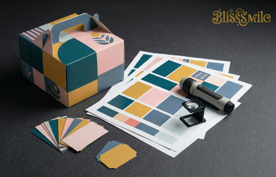
What to Check Before You Sign Off on a Proof
When you get your hard proof for your custom printed cake boxes, do not just glance at it and say it looks fine. Take your time and inspect it carefully. First, look at the colors under proper lighting. Standard office lights or warm household bulbs can trick your eyes. Ask your printer if they have a standard light booth, or take the proof outside into natural daylight if possible. Compare the printed colors directly against an official Pantone swatch book, not against what you remember seeing on your screen. Check all the small details too. Is your logo crisp and clear? Are there any smudges or misalignments? If your box has multiple panels, make sure the colors look consistent across all of them. Sometimes the same ink can look slightly different on a folded edge or near a glue flap. Also, pay attention to any special finishes like spot UV or foil stamping. These elements interact with the underlying ink and can change the final look. Once you are completely happy with the proof, sign it and keep a copy. That signed proof becomes your reference point. If the final shipment looks different from the approved proof, you have every right to ask for a reprint.
Keeping Colors Consistent Across Multiple Print Runs
One of the biggest headaches for growing bakeries is maintaining the same color quality when you reorder boxes months or even years later. Maybe you started with a small batch of 500 custom printed cake boxes, and now you need 5000 more. The color on the new batch should match the old one perfectly. This is where that signed proof and those Pantone numbers become your best friends. When you place your reorder, remind your supplier of the exact Pantone codes you used before. Send them a photo or even a physical sample from your previous order if you still have one. Ask them to provide a new proof before running the full quantity. A good supplier will keep records of your past orders and can often reproduce the same color formula reliably. But do not just assume everything will be fine. Quality control standards can drift over time, and different operators might mix inks slightly differently. Stay involved in the process, ask questions, and never skip the proofing step just because you are in a hurry.
A Final Word on Getting the Color Right
Ordering custom printed cake boxes with perfect color is not magic. It is a process. The key is to understand how colors behave differently on screens versus paper, to use Pantone numbers as your color language, and to always insist on physical proofs before mass production starts. It might feel like extra work in the beginning. But trust me, that small investment of time and money will save you from the nightmare of receiving a thousand boxes that look nothing like your brand. Your packaging is the face of your bakery. Make sure that face looks exactly the way you want it to.
Table of Contents
- Why Colors Go Wrong Between Your Screen and the Box
- How Pantone Colors Take the Guesswork Out of Branding
- The Right Way to Prepare Your Design Files
- Soft Proofing versus Hard Proofing What You Actually Need
- What to Check Before You Sign Off on a Proof
- Keeping Colors Consistent Across Multiple Print Runs
- A Final Word on Getting the Color Right